The idea of this blog post was to discuss the importance of the images the public don’t see, but which make up part of the process for the photographer. Inspired by a recent visit to a Willy Ronis exhibition in Venice and with a little example of my own, I also consider how shooting digitally may affect the process…
Who was Willy Ronis?
Willy Ronis was a French photographer well known for his street & social documentary photography. His work was chosen by Edward Steichen to be displayed in the 1953 ‘Work of Five French Photographers’ exhibition at the Museum of Modern Art, New York (MOMA). Not long after, in 1957, he was awarded a Gold Medal at the Venice Biennale, this is one of the reasons his work is currently on display at the Casa dei Tre Oci in Guidecca. Amongst the 120 images on display there are also some of his contact print sheets & negatives which inspired this blog.
The Working Process
It’s always fascinating (I think!) to see the images that didn’t ‘make the cut’ so to speak. Looking at a set of negatives can start to reveal some of the working processes of the photographer and indeed the route to construction of certain images. Take this famous example below, in the text at the exhibition Ronis explains that he was alerted to the Gondolieri as their voices became audible to his left, he knew he would have one chance to make the image as they walked across the scene and ‘click’ there it was.
Image: Willy Ronis (1910-2009)
What’s clear in the contact sheet prints is that he’d been waiting here for at least a number of minutes watching various potential scenes unfold. This is one of six images made at that location, each one no doubt building to the ‘decisive moment’ which he chose as the ‘winning’ image from this scene. You see in the contact prints a change in exposure and also how the image needs some action on the right hand side to balance and impart energy, it changed the dynamic totally from just the ladies chatting with the child. He knew this of course and it was a matter of waiting for the characters to enter the scene accordingly.
There are however also examples of images where the moment was so fleeting that just one or two images were made, these are times where it’s now or never. In the image below (also in Venice) there were just two versions on the contact prints, the first with the girl heading out (as shown below) and the second with her returning.
Image: Willy Ronis (1910-2009)
In the second image, the girl is returning towards the street and her body is directly in line with the wooden support on the gangway. This is just one of the reasons why the first image (as shown) is stronger, because of the separation and balance of elements, but also perhaps because here she is heading somewhere, but we’re not sure where. It’s an extra element of intrigue, the beginning of a journey into a relative unknown, however brief.
Modern Relevance?
So, what does all of this have to do with anything we may be thinking about in our photography today? Well, firstly many of us now shoot digitally which has an affect on our ‘in-field’ processes. The ability to immediately assess an image on the live view or viewfinder review screen helps inform our aesthetic choices. For the film photographer it’s an expensive habit to shoot and re-shoot scenes without being able to quickly see the results. It does also depend what style of photography we might be shooting though.
For example, the street photographer is often waiting for a scene to unfold, for characters out of his/her control to enter the scene and to react accordingly. It’s a situation that may also apply to landscape photographers, we may be waiting for a change in weather or the flow of an incoming tide for example. All genres excel in the ‘optimal light’ for the scene and of course the craft is to make compositional sense and order out of whatever the elements in front of us may be.
My Approach
I wanted to try and show an example of how I approached a certain simple scene, with a bold graphical element, and how the images that I wouldn’t normally show contributed and brought clarity to the final image choice from that scene.
I know some photographers find they start wider and work in to find the detail, others (Bruce Percy being one I believe) start closer and gradually work wider if required. The idea of this second approach is that perhaps you have already identified the core essence of what attracted you to the scene and then you build upon it, as opposed to having to distil down to what you originally were attracted by. The ability to make the visual connection from eye to composition in camera will affect your approach here and I find that sometimes I go both ways.

The final image: A balance of extraction, colour and shape
The above image was made in Napier, NZ. There is an interesting modern sculpture that extends from the beach into the sea. I knew there were shapes, colours and flow to play with when I saw the structure and I’ve tried to retrospectively review my approach below, in the order the images were made.
The Process - In Order
As mentioned above, I often work closer in, further out, or indeed just throw around visual ideas as I’m exploring a scene. Some may argue this shows a lack of clarity in my approach or assessment of a scene, perhaps that I’m unclear on my purpose. However, I would argue that there are multiple ways to successfully interpret a scene or element and this working process is no different to a chef experimenting with flavours, seasoning or indeed presentation.
The images are displayed below in the order they were shot. One quick note: Yes, they are processed differently. At the time I was bouncing between colour or black and white and the camera I now use allowed me to explore that ‘live’ (which is something I’ve enjoyed adding to my process) but more on that later.

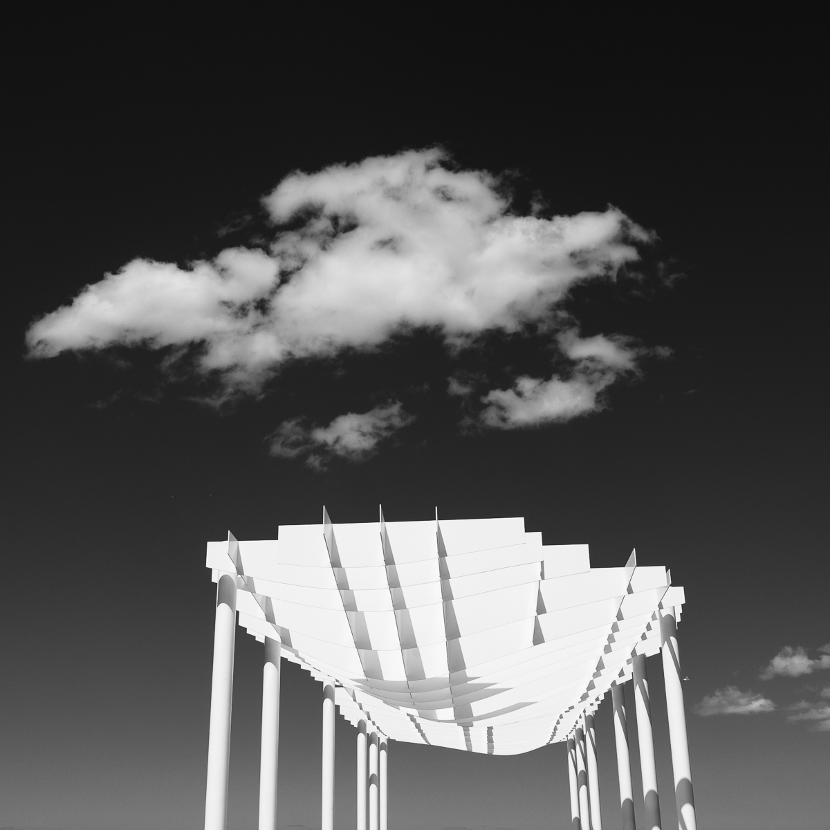
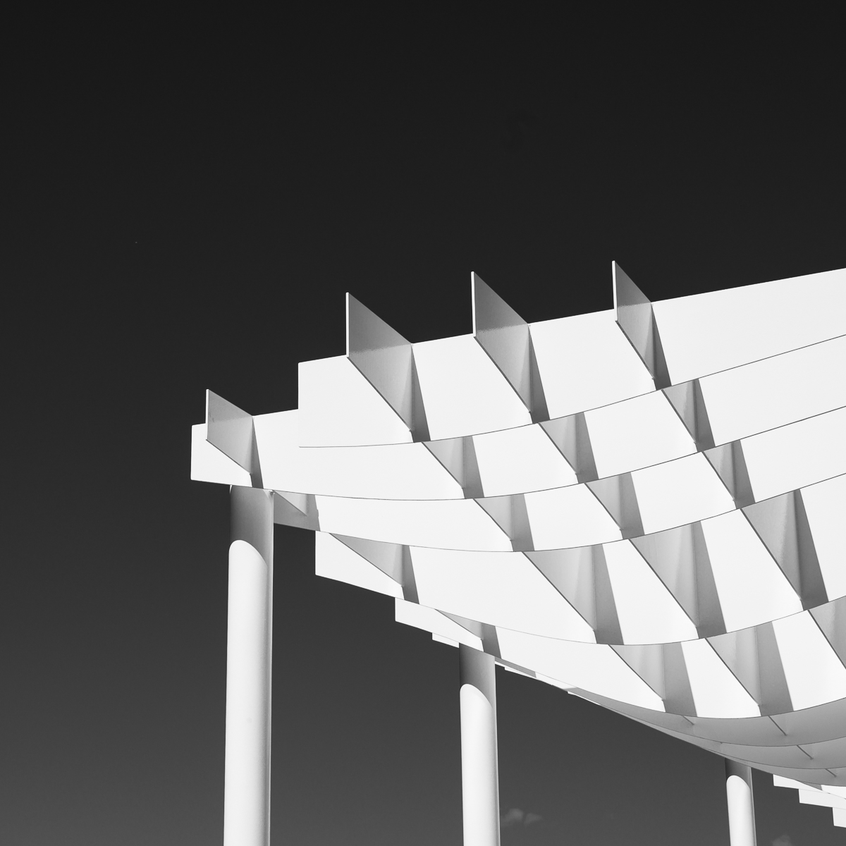
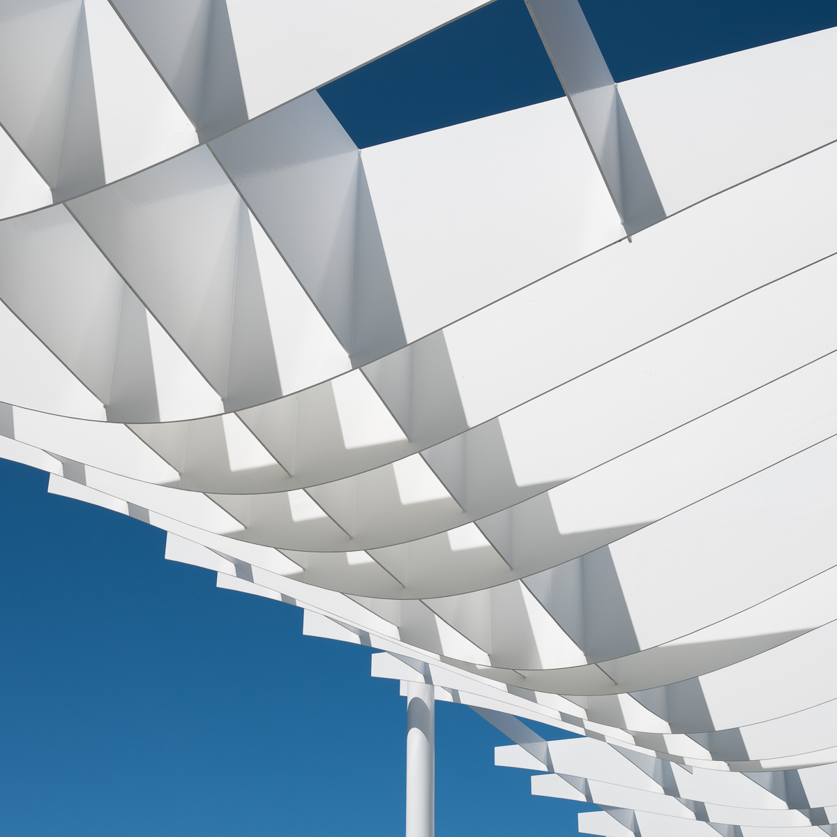
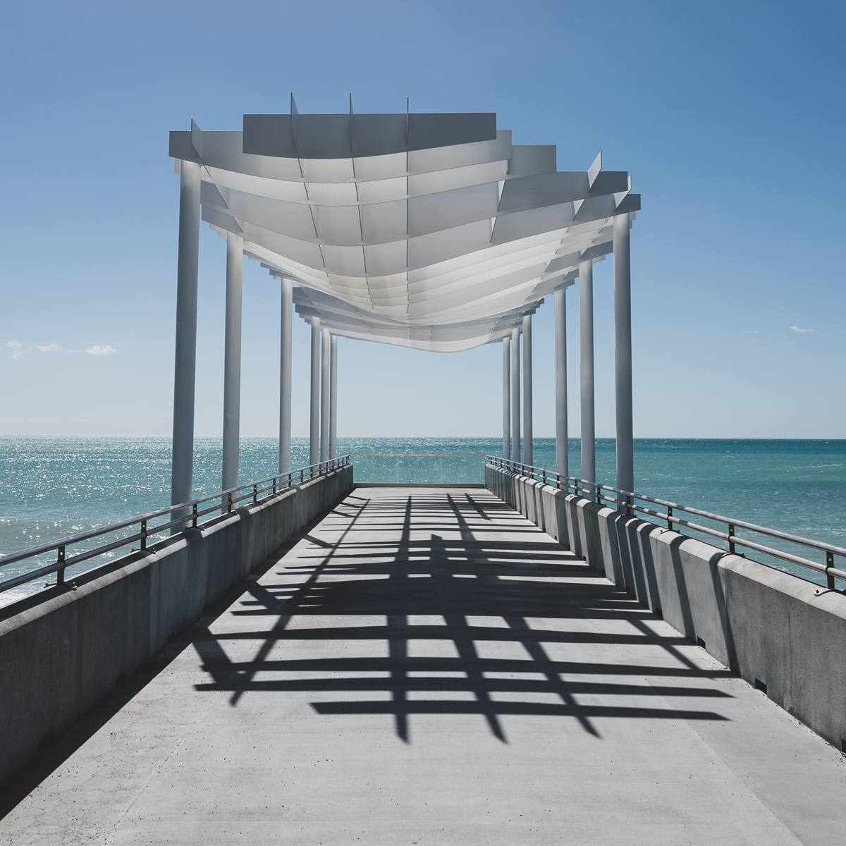
Image by Image - Developing Ideas
Image 1
IMAGE 1: This is the first image I shot of the structure. There were certain things going though my mind immediately that led me this way:
Part of the attraction was the shapes of the structure. I wanted to emphasise these by extracting and abstracting them from the overall construction.
There were various people stood under the structure, one way to cope with that is to simply remove them from the scenario.
The structure had a clean white colour and the high-key black and white treatment helped add something to the graphic design.
By extracting this segment there is some ambiguity about what we’re actually looking at and that forces us to look more at the shape and flow rather than tying it to an objective structure.
Image 2
IMAGE 2:
Stepping back I wanted to show the structure a little more clearly, essentially making it more obvious.
I chose to do this partly because of the cloud above which I thought added balance. Arguably it could work without but because the ‘legs’ of the structure are cut-off, I felt it needed a similarity in the sky (i.e. something else light) to potentially distract from the fact those legs don’t finish.
It doesn't really work. The clouds on the right hand side are a bit distracting and there’s not getting around the cut-off legs issue. What you can’t see is that there are still people there so I was compromising by framing higher into the structure.
Image 3
IMAGE 3:
Moving back in helps create a stronger image.
It’s let down by the small clouds near a couple of the lower legs, and perhaps the whole composition is too bottom right heavy.
Direct sunlight and blue skies vs white structures can work very well in B&W and it was good to preview this live using the viewfinder on the Nikon Z6.
Undoubtedly this closer approach leads to the next image (my preferred choice). The cogs are turning…
Image 4 (My Preferred Choice)
IMAGE 4:
You can see this is perhaps a result of the previous images where I’ve been trying to find the right balance between extraction and compositional flow.
In my opinion this is the best balanced compositionally because the visual ‘weight’ of the structure is evenly dispersed across the frame, with room to breathe in that bottom left corner.
In terms of colour vs B&W, although it was potentially B&W inspired you just can’t beat a clean blue and white combination. The contrast allows the structure to ‘pop’ out of the background.
The lack of any pesky clouds helps and I stood for a moment waiting for them to clear accordingly.
Image 5
IMAGE 5:
The postcard shot! This is more of a record shot for me. Finally everyone cleared away and so I took the chance to shoot the structure in its entirity.
The strong foreground shadow adds some depth and interest but fundamentally I find the extraction shots more visually interesting. This is because of the focus on flow, curves, lines and the semi-abstraction which adds some ambiguity.
The Process - Retrospectively Deconstructed
You may ask: Are you really thinking these things as you shoot? The answer is yes to some degree, and perhaps some is happening in my sub-conscious. It may seem indulgent to retrospectively project a thought process onto the images afterwards but I find that de-constructing your own images and shooting patterns is a helpful way to self assess and improve.

New Nikon Z6
I mentioned earlier that shooting digitally informs my process. I’m happy shooting film sometimes but I do find that one major advantage of digital is the chance to immediately review and tweak compositions. Part of me is heavily influenced by the Precisionist style of work that I love to see, and that side fights with the looser, exploratory style I often employ when trying to unlock the compositional essence of a subject or scene.
The chance to not only see the composition in the required aspect ratio through the viewfinder, but also to see it in potential edited form (i.e. choose from multiple processed versions) on the new Nikon Z6 that I use has been a really helpful creative tool. It allows me to get as close as possible to the finished article at the moment of capture. This post is not about gear (although there will be a Z6 review coming soon), but gear here is relevant, it affects how I approach a subject and thus the final outcome.
In Summary
If you’ve made it this far then hopefully you’ve found some of this interesting. I would certainly recommend looking back at your shooting patterns. Perhaps start with your chosen ‘winner’ from one scene or another and then look at how you shot before and after that at the same scene/location. There could be some points to learn from and you may start to see common threads to how you approach things. Were you waiting for a different light? Did you change the composition? If so, why? Did you get stuck in one place? Could you have moved around more, explored a different angle? Were you thinking about the finished image? This de-construction may help you think about a new way, or indeed it may simply help you become more efficient in your shooting approach.